How do visitors plan their visit to NGA's campus?
A moderated usability study uncovering how Sightseers find their way digitally.
01 · The Problem
The NGA just launched a new campus page. Did it actually help visitors plan?
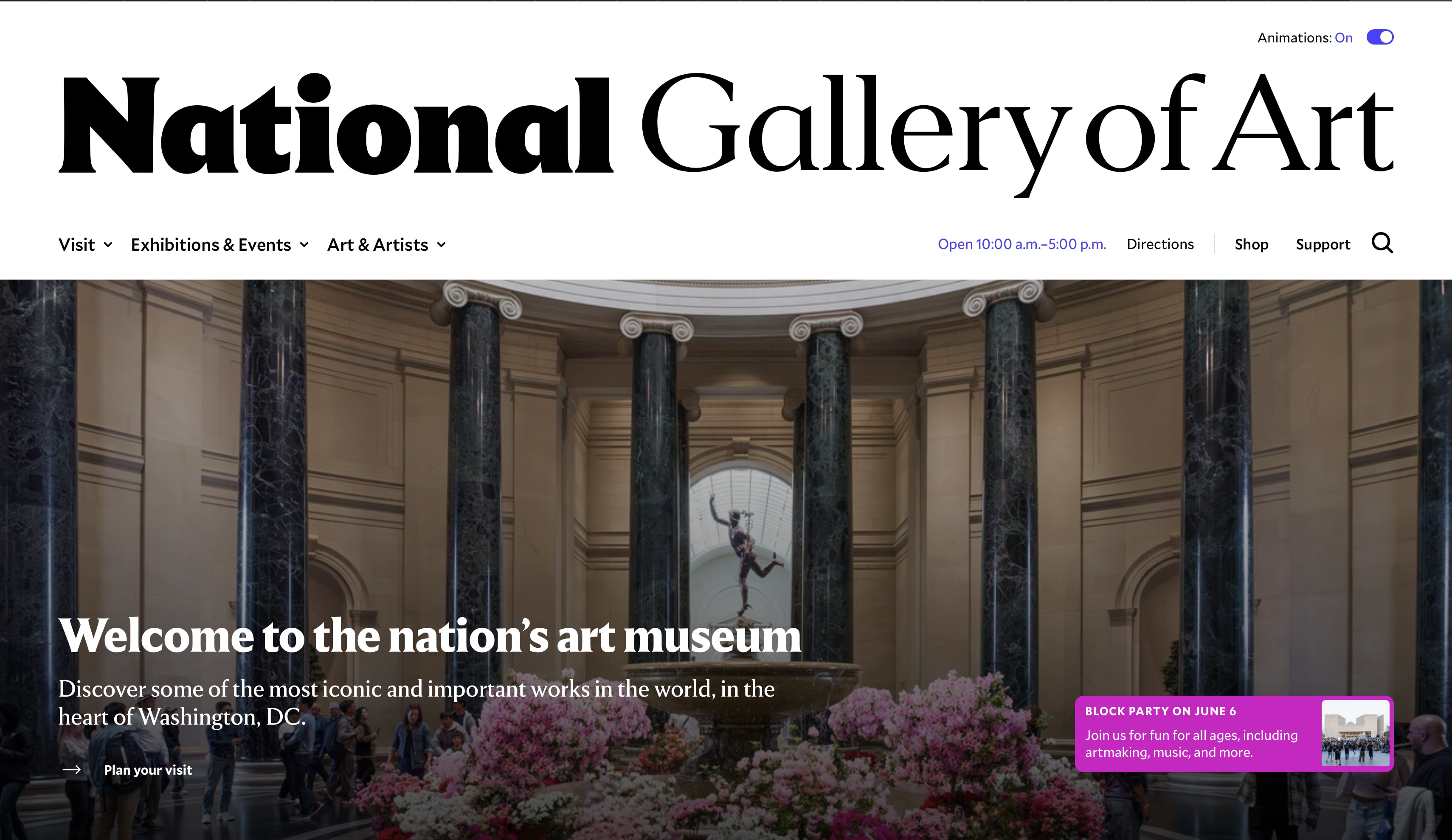
The National Gallery of Art is a premier art museum on the National Mall in Washington D.C., home to over 160,000 works by artists like Leonardo da Vinci, Monet, and Van Gogh. It attracts nearly four million visitors a year, many of whom are visiting D.C. for the first time and squeezing the NGA into a packed itinerary.
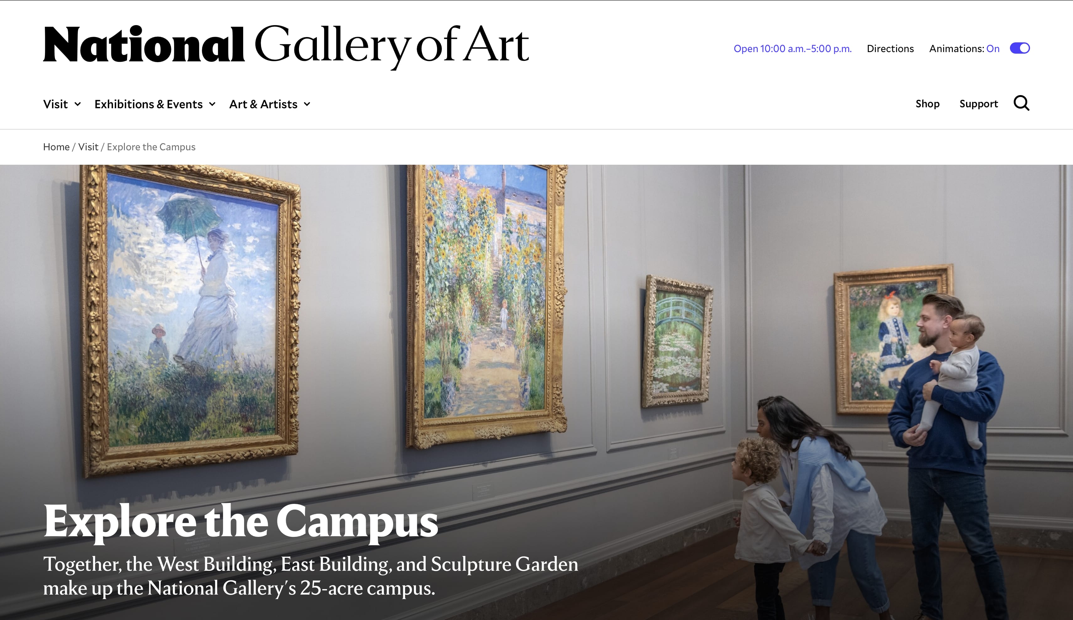
The NGA had just launched a new "Explore the Campus" page to help visitors navigate across its three areas: the Sculpture Garden, the West Building, and the East Building. Through prior research, they'd identified a key user type for this page: the Sightseer. According to NGA data, 75% of their site visitors are first-timers and 61% are on mobile — this is a user with little to no familiarity with the institution, who may only visit once, and who relies heavily on the website to plan.
The NGA's prior research also gave us a useful framework for thinking about what a Sightseer needs from the site. They called it Skim, Swim, and Dive. At the Skim level, visitors need basic logistics: how big is the campus, where are the entrances, how long will this take? At the Swim level, they're trying to understand what each building offers so they can decide where to spend their time. At the Dive level, they're looking for a specific artwork tied to something they already care about, and trying to figure out exactly where to find it.
Our goal was to find out whether the new Explore the Campus page, alongside the existing Plan Your Visit page, was actually serving Sightseers at all three levels — and to validate whether recent changes had reduced previously identified pain points or introduced new ones.
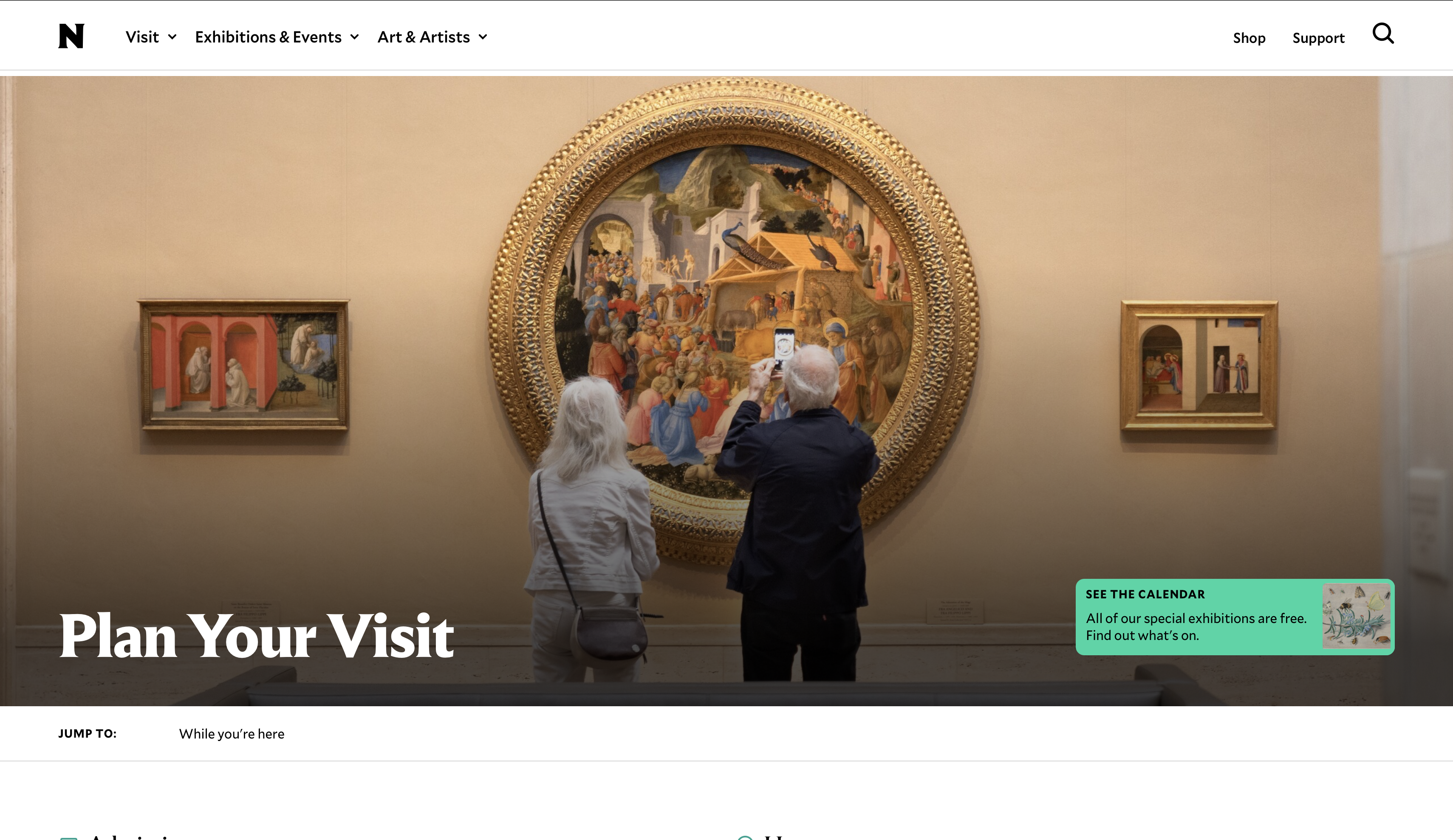
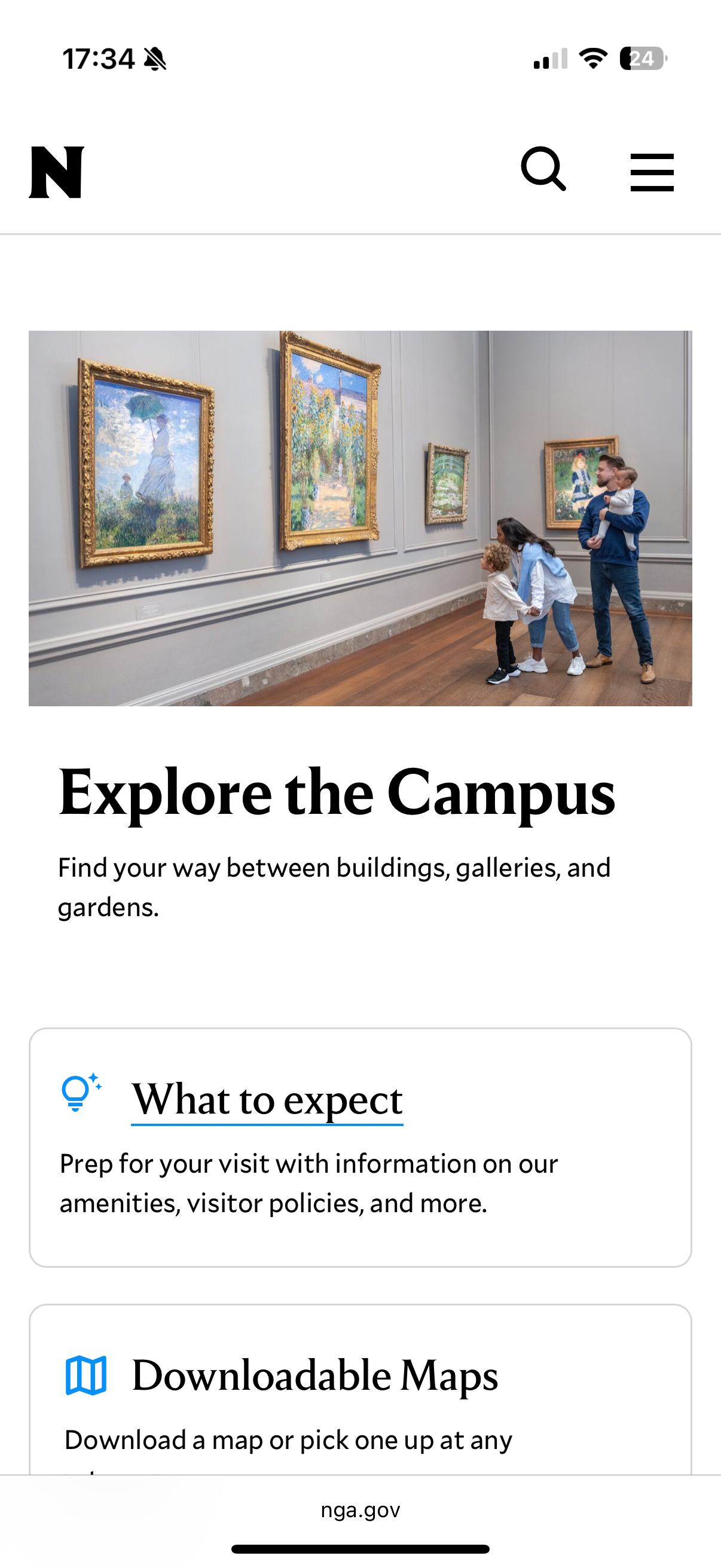
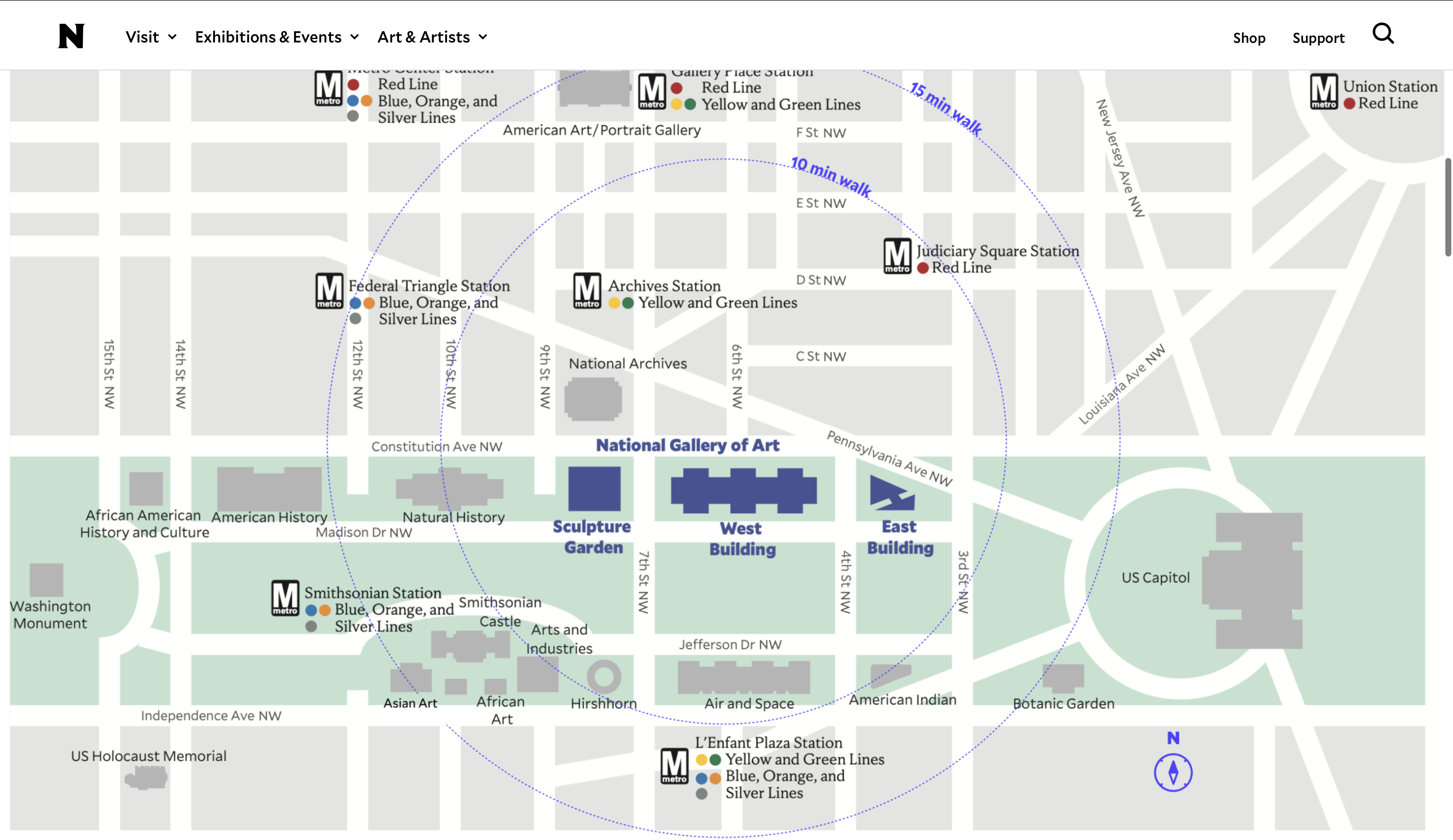
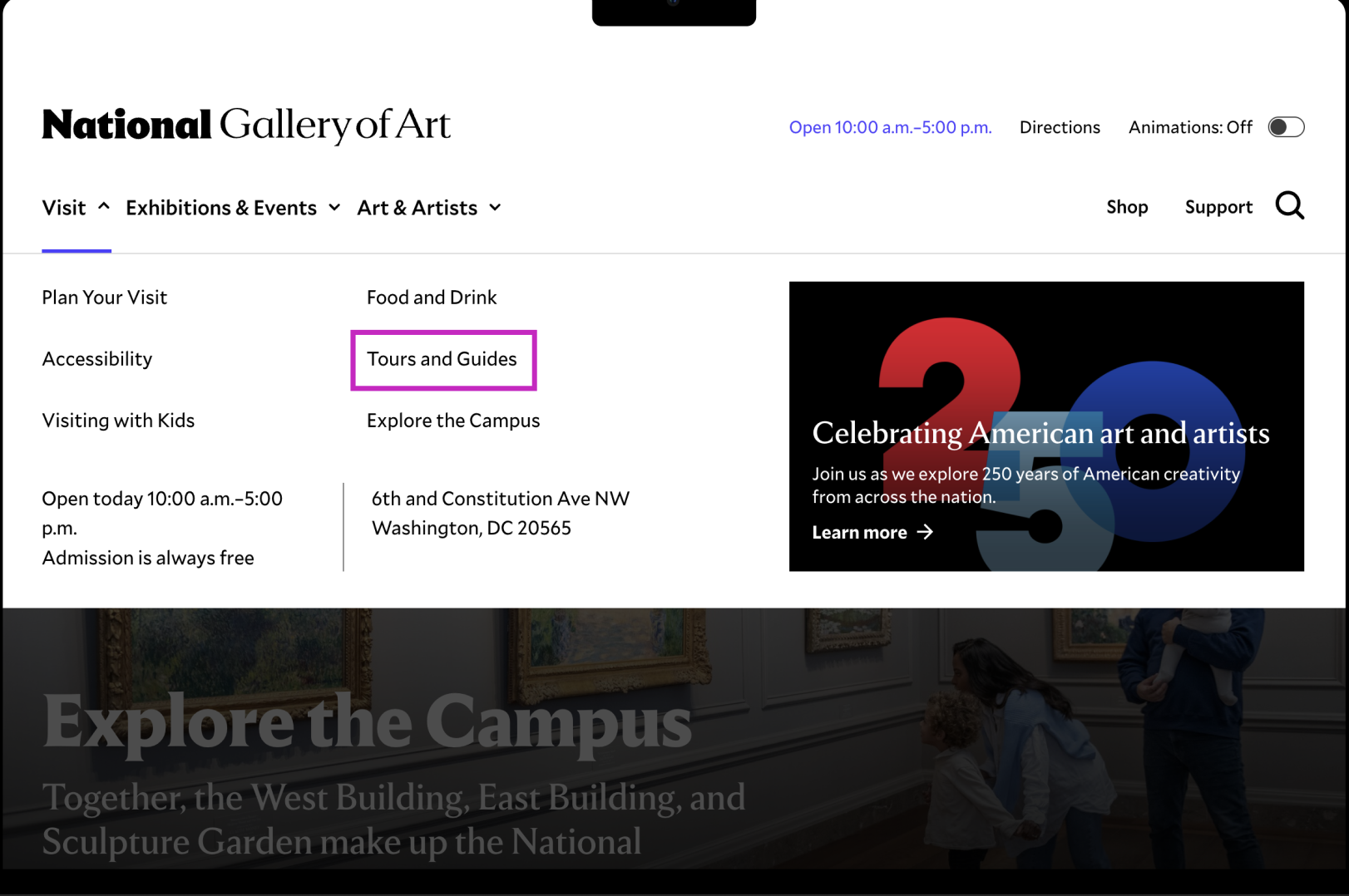
The starting point for all participants in the study
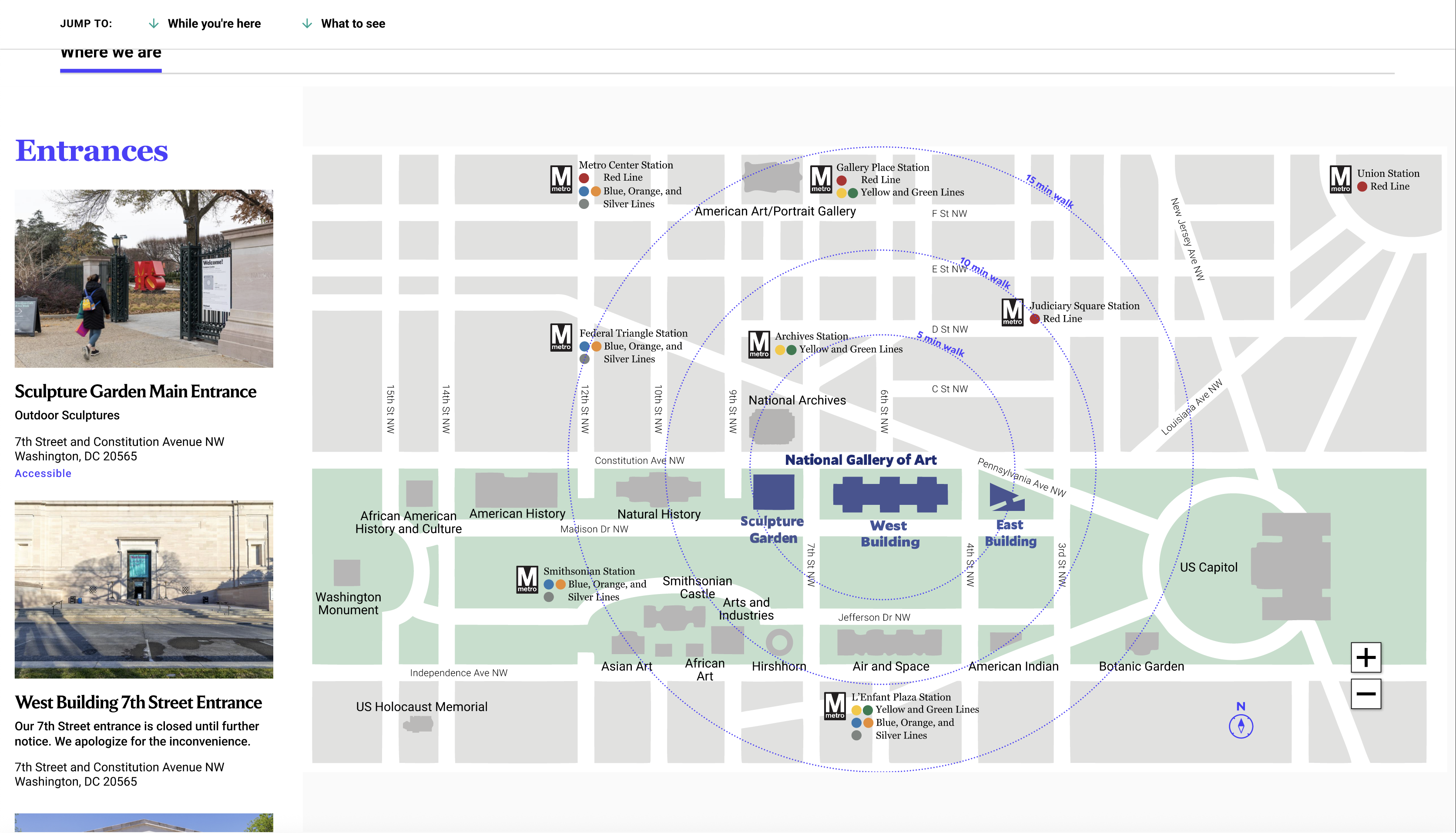
The newly launched page and primary subject of our evaluation
My Role
I was part of a four-person UX research team from Pratt's IXD program. We each moderated and took notes across sessions, then synthesized findings collaboratively. I owned Findings 1 and 2 and their corresponding recommendations — covering the Plan Your Visit page structure and the campus map.
The content was there. The structure made it nearly impossible to find.
Hours, admission, exhibitions, artists, campus maps. The NGA had all of it. The problem was that key information was buried under scroll depth, interactive elements didn't look interactive (especially on mobile), and maps told visitors where things were without helping them decide whether those things were worth seeing.
02 · The Solution
What we found, and what we recommended.
We ran eight moderated usability sessions in April and May 2026, split evenly between desktop and mobile. Across all of them, the same patterns kept showing up: participants could find what they needed, but not without friction. And on mobile, some key content wasn't findable at all. The study produced 13 total recommendations across 4 key finding areas.
A lot of info but not bad info. I just wish I didn't have to scroll so much to get to the parts that mattered.
Participant, post-test debriefThe Plan Your Visit page has what Sightseers need. The structure makes it hard to find.
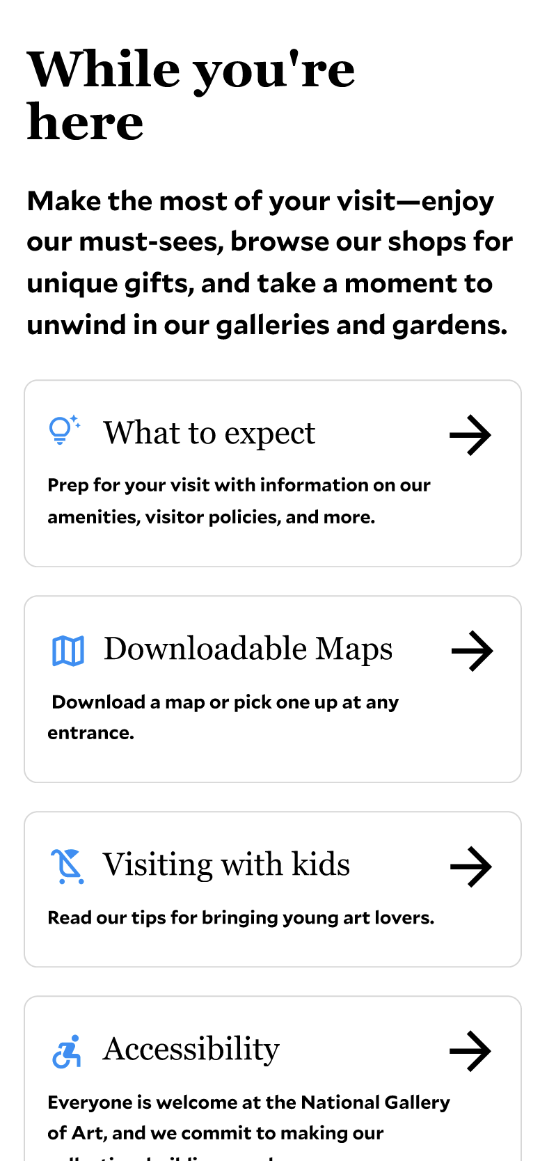
Participants consistently called PYV the most useful page on the site. But all four mobile users missed the Explore the Campus card entirely, reading it as a label rather than a link. The While You're Here section, which most found helpful once they reached it, was buried deep enough that many never got there.
Add a What to See jump link at the top of the page
The What to See section sits below the fold. Users who were already on-site and looking for must-sees had no fast path to it. A jump link near the top of PYV removes that scroll burden.
Current state
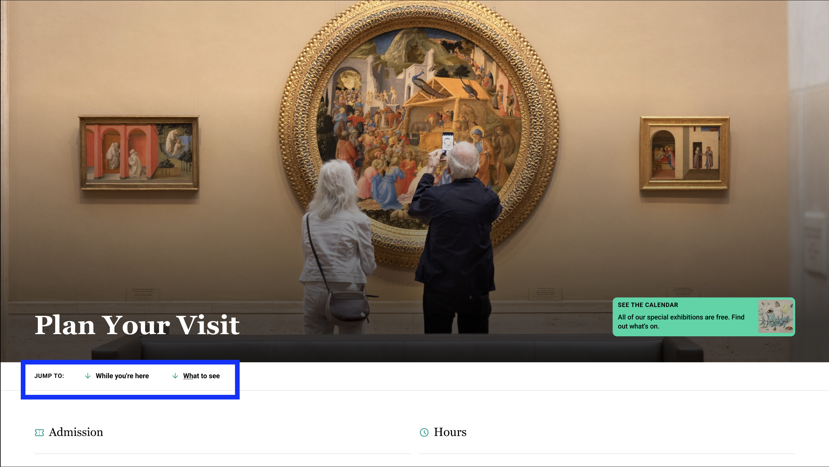
What to See and While You're Here jump links added
Add a directional arrow to the Explore the Campus card
All four mobile users read the Explore the Campus card as a description, not a link. A simple arrow makes the affordance explicit and tells users — especially on mobile — that tapping it navigates somewhere.
Current state
Card with directional arrow
Remove the large background image from the While You're Here section
The full-width background image caused white text to become illegible as participants scrolled. Every participant on every device type was confused by this section. Removing the image fixes the contrast issue and makes the section readable regardless of scroll position.
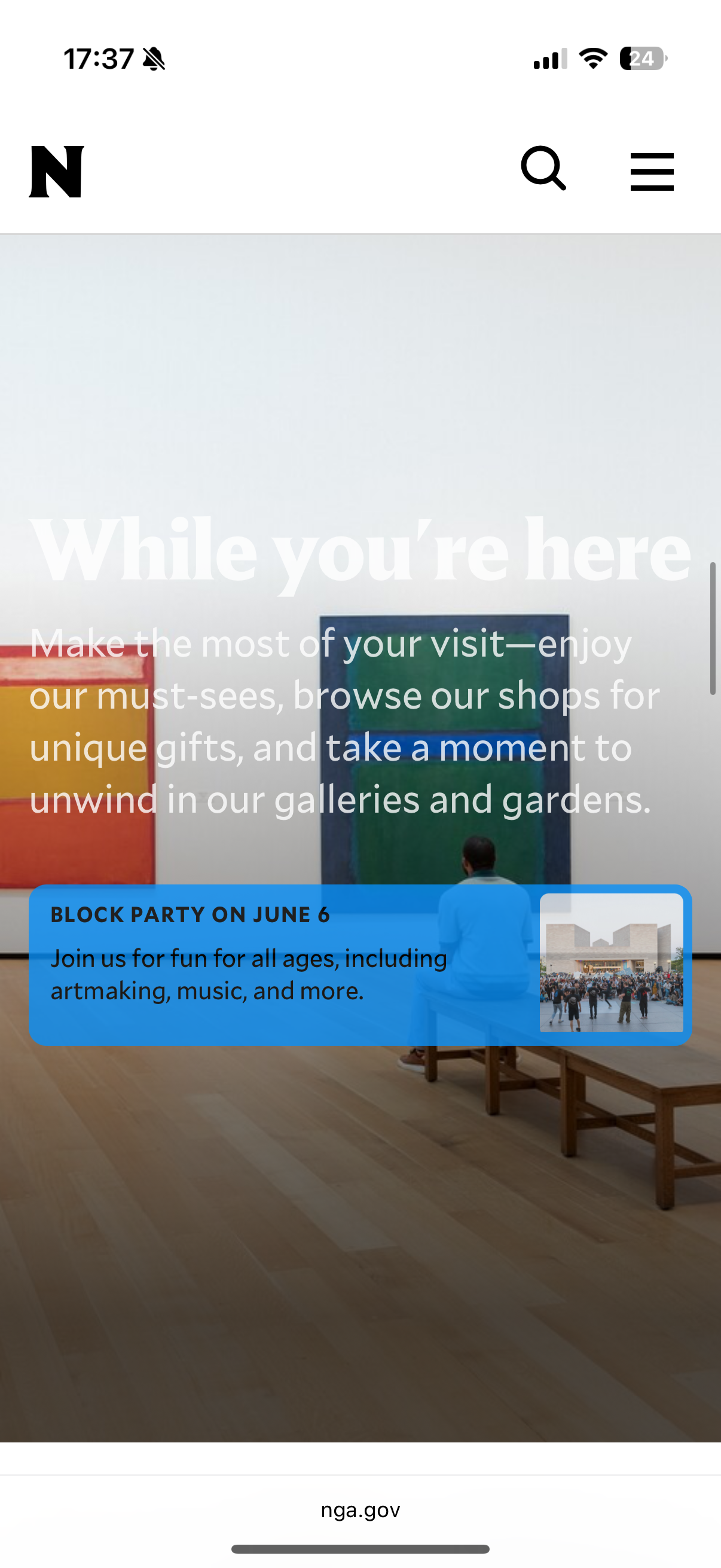
Current state
Clean, readable While You're Here section
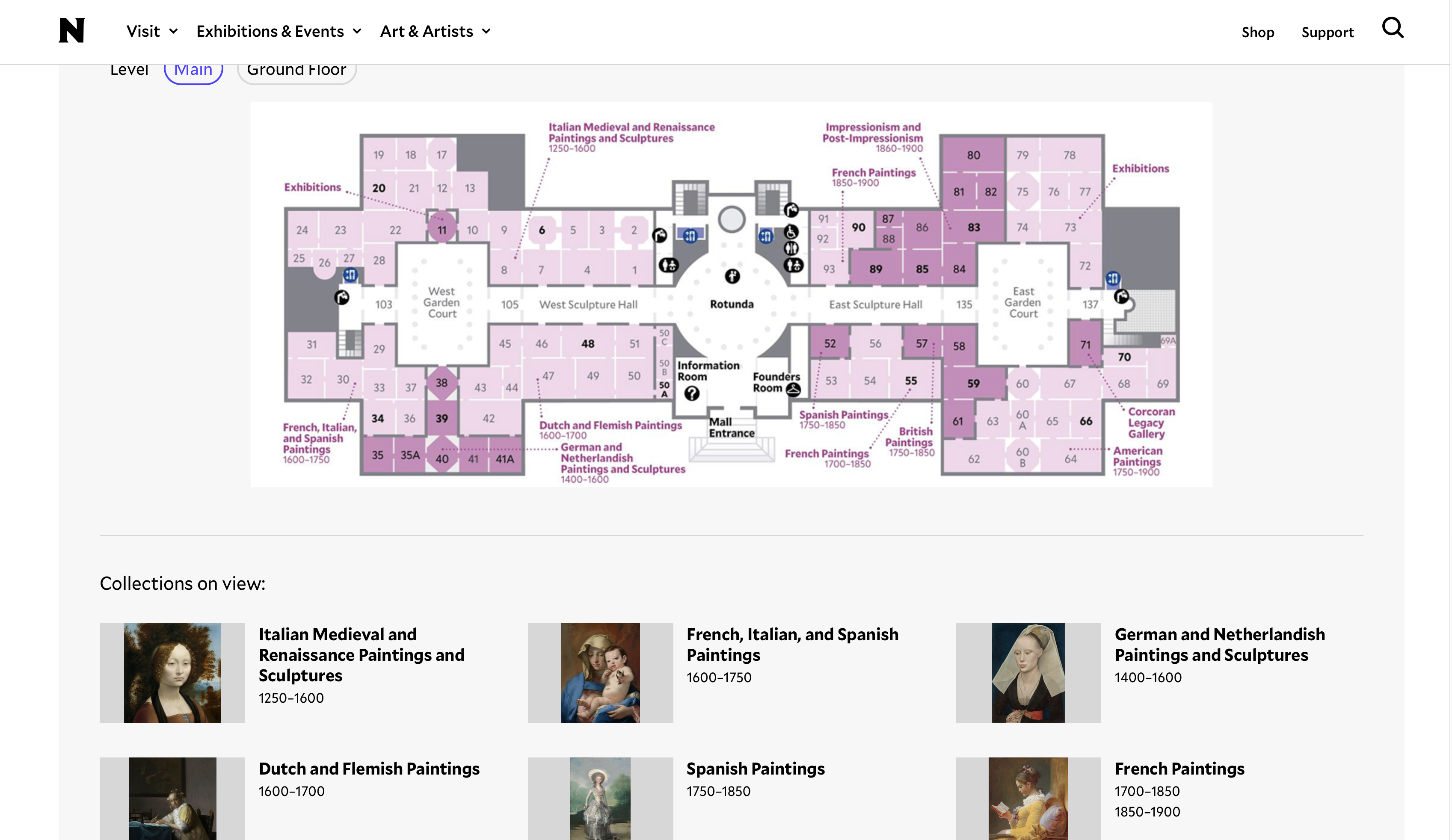
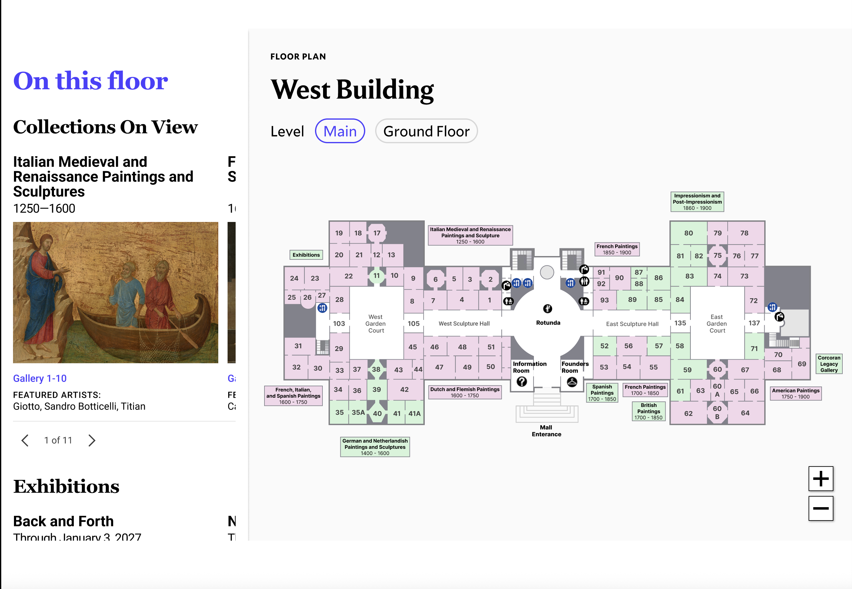
The campus map shows where the buildings are, but not what it's like to move between them.
Every participant correctly identified the three buildings using the map. But when we asked them to estimate how long it would take to walk between buildings, most couldn't do it. The map didn't give them a frame of reference, and several opened Google Maps instead. The entrances tab was another gap: participants who needed it rarely found it unprompted.
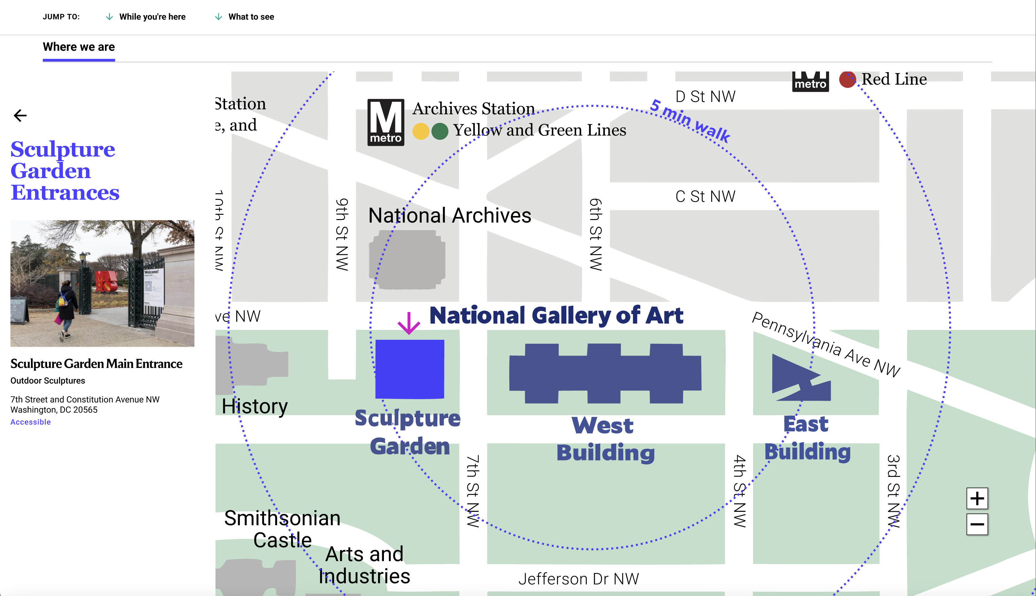
Add a third radius circle encompassing all three buildings
The existing two radius circles communicate how far the NGA is from the metro, but don't help visitors understand how long it takes to move between the three buildings on campus. A third, smaller circle encompassing all three gives an immediate sense of the total campus walking envelope.
Current state
Full campus footprint visible
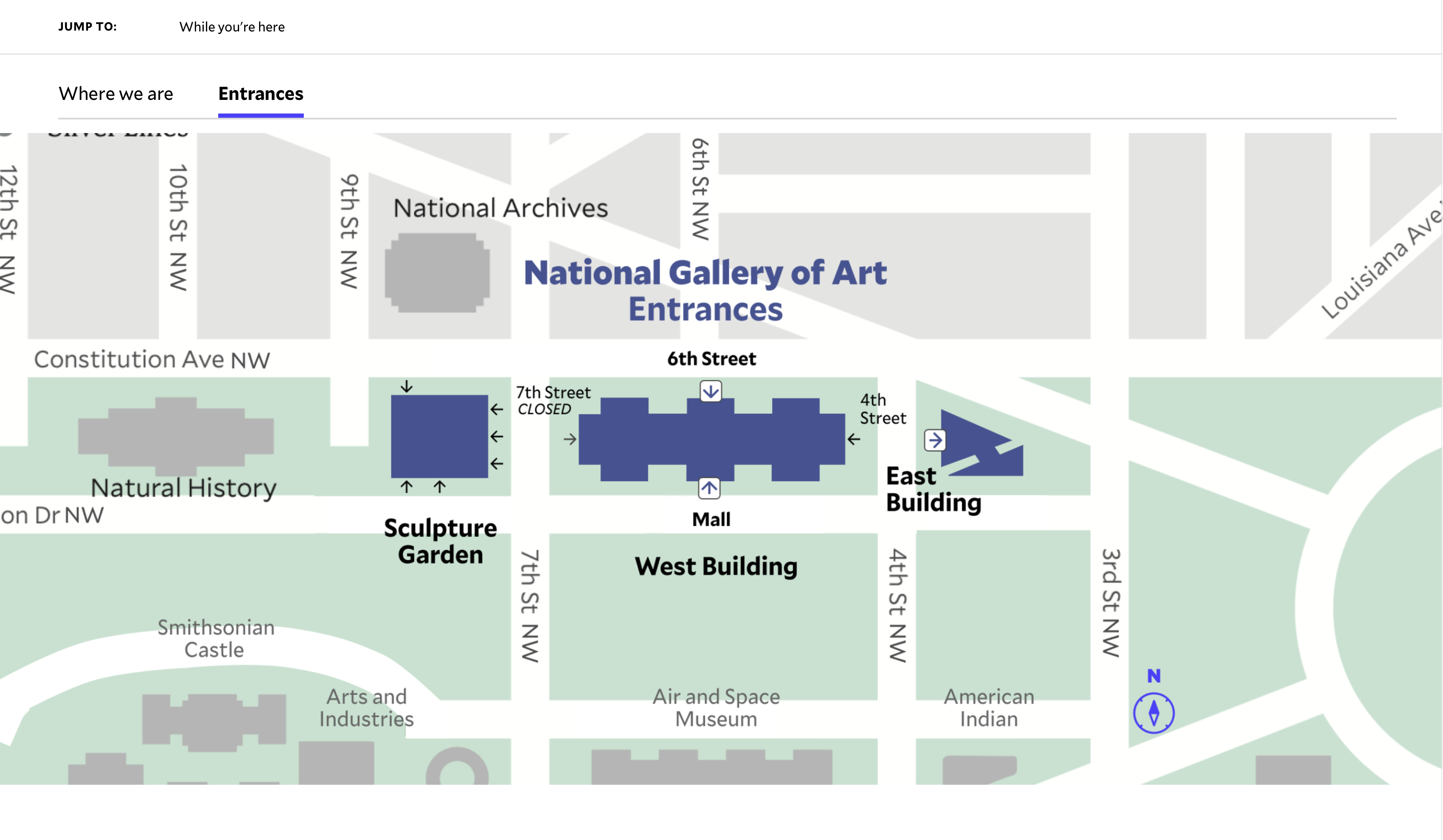
Replace the entrances tab with an interactive map layer
Participants who needed entrance information rarely found the entrances tab unprompted. Surfacing entrance info directly on the map — triggered by selecting a building — matches how Sightseers naturally approach the wayfinding task: they think about a building first, then how to get in.
Current state
Entrance info surfaced on the map by building
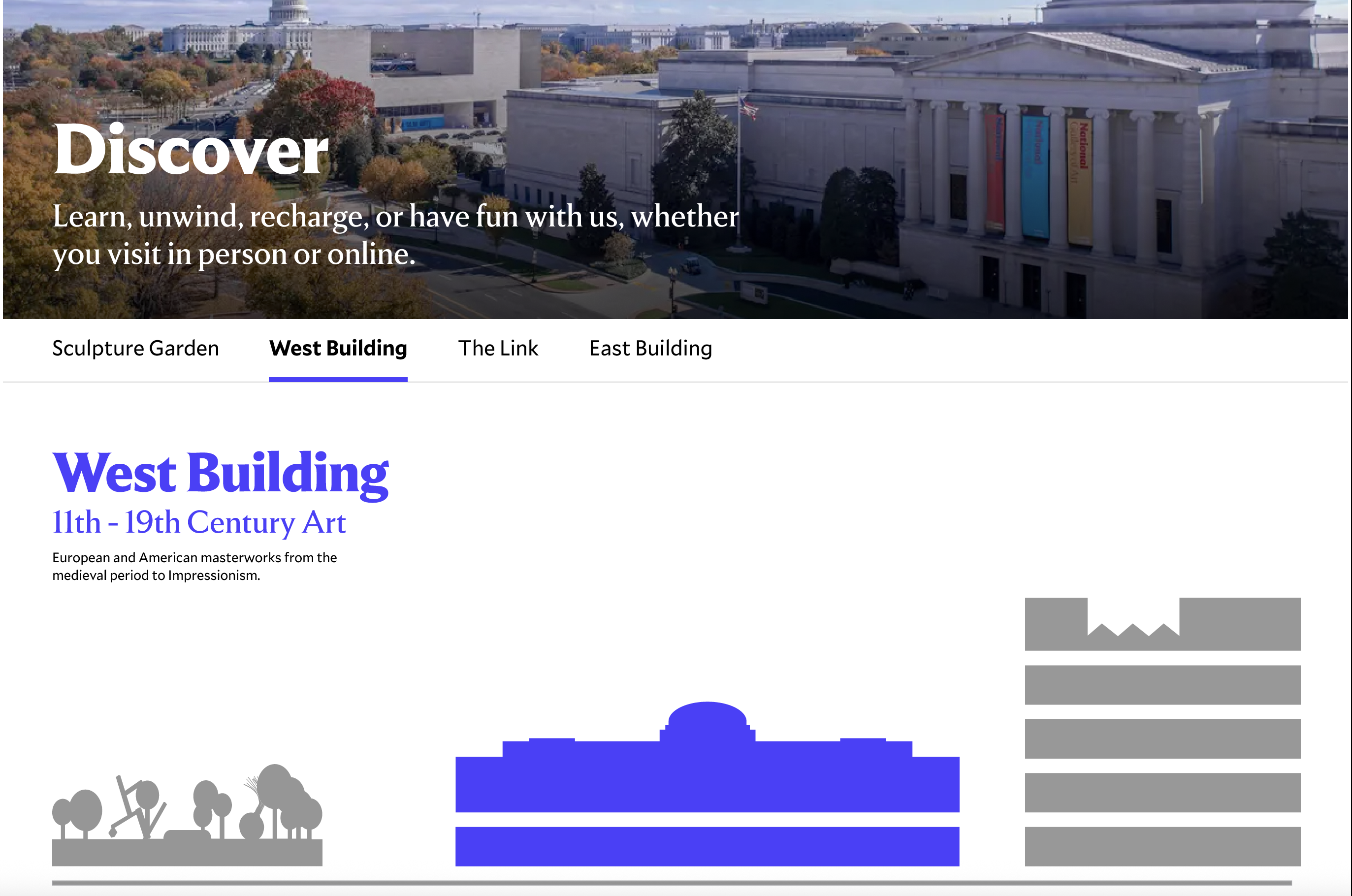
Sightseers need to know what a building is about before they'll commit to visiting it.
When participants landed on Explore the Campus, the first thing they did was try to rank the buildings. But the existing labels didn't give them enough to go on. Most ended up clicking into each building page just to figure out what was inside before making a decision. The one element that actually helped? The popular artists carousel — familiar names paired with recognizable images gave people an instant sense of what a building held.
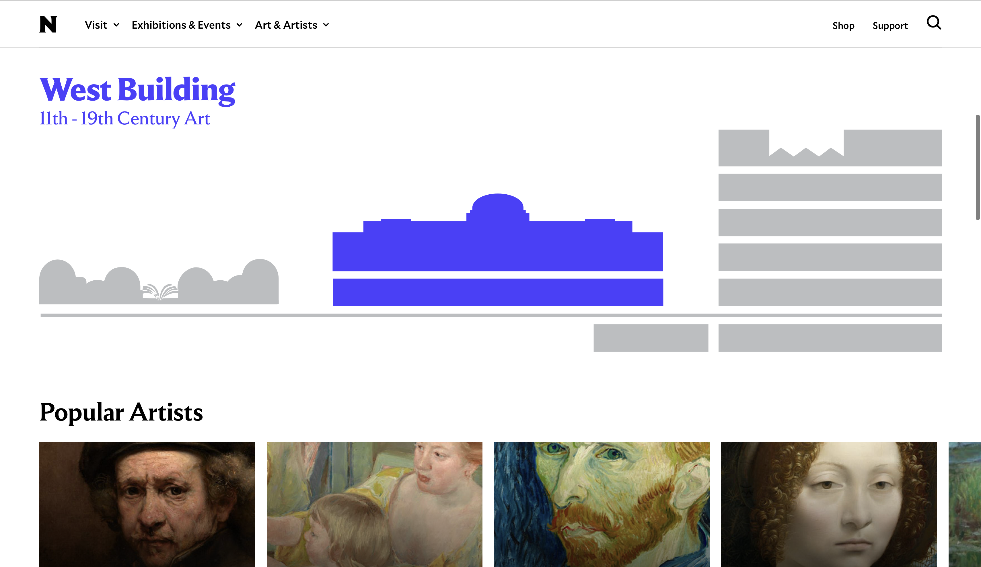
Add a one-sentence description under each building name
A single sentence — 'European and American masterworks from the medieval period to Impressionism' — gives visitors the context they need to make a decision without clicking through. Position matters: it should sit between the building name and the illustration so it's read before the visual.
Current state
One-sentence description added
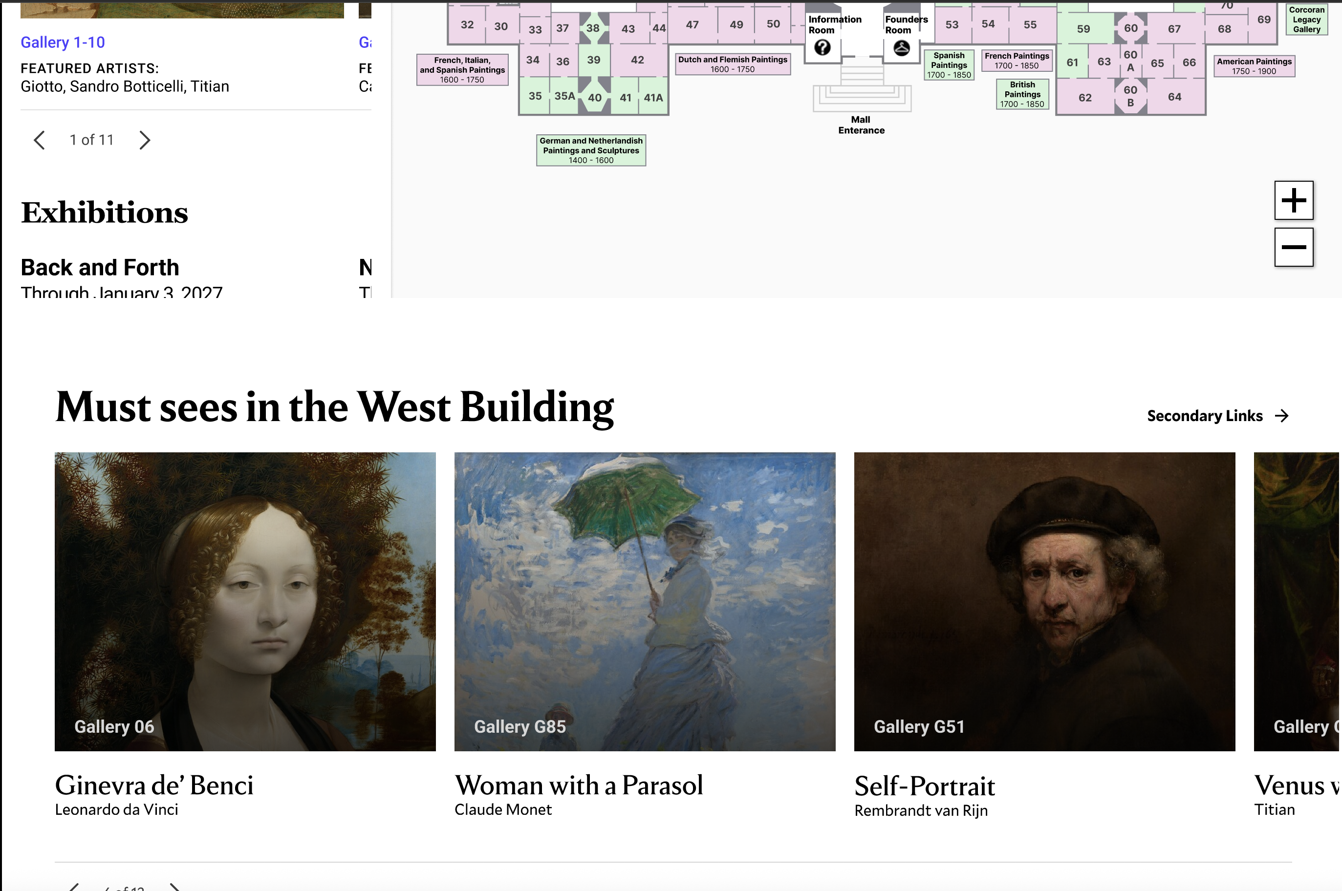
Add a Must-Sees carousel inside each building section
Must-sees were one of the first things participants responded to positively across the study. The format worked — a visual, scannable set of highlights. Each card shows artwork image, title, artist, and gallery number overlaid, so location is immediately visible without any additional interaction.
Current state
Must-Sees carousel with gallery numbers overlaid
Bring guided tour listings into each building page
Several participants were open to including a tour, but couldn't evaluate whether any given tour was relevant to the building they were thinking about. Tour listings currently live on a separate page. Pulling them into each building section means users can see what's available without navigating away.
Current state
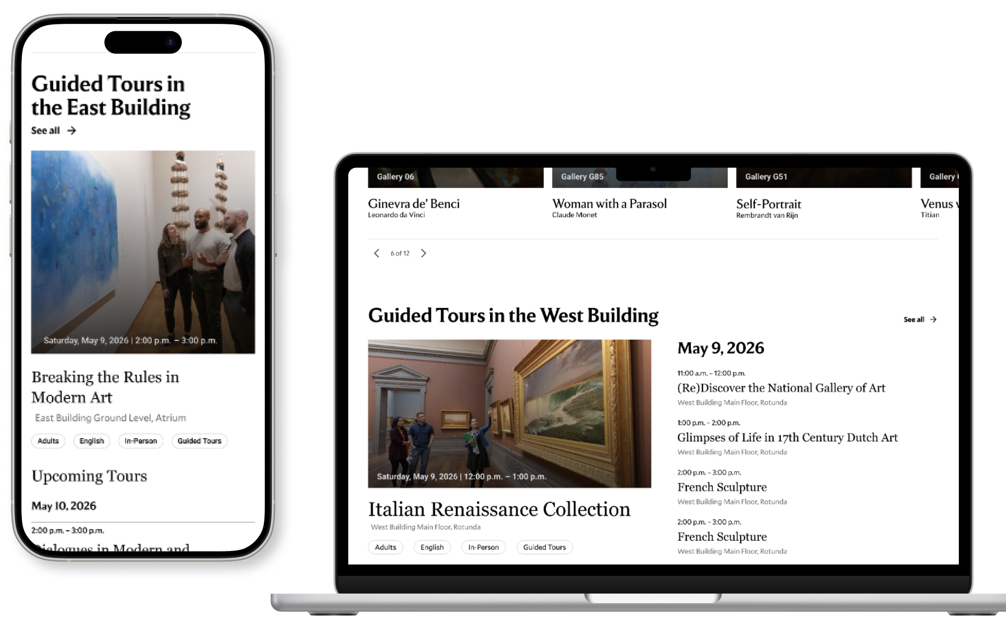
Tour listings in building context
Add a cafe section at the base of each building section
Food came up organically across multiple sessions — not because we asked about it, but because participants were mentally planning a full day and factoring in where they'd eat. A cafe card at the base of each building section (name, entrance location, hours, menu link) means they never have to leave the page to answer that question.
Current state
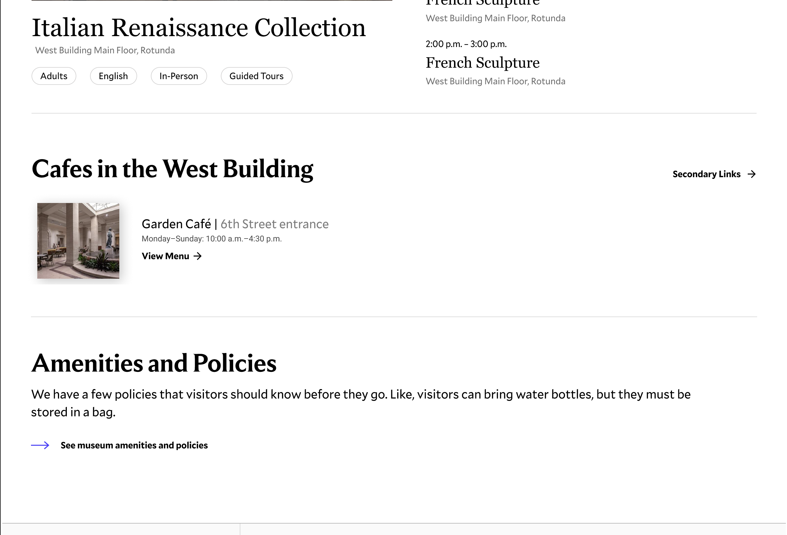
Cafe card with hours and menu link
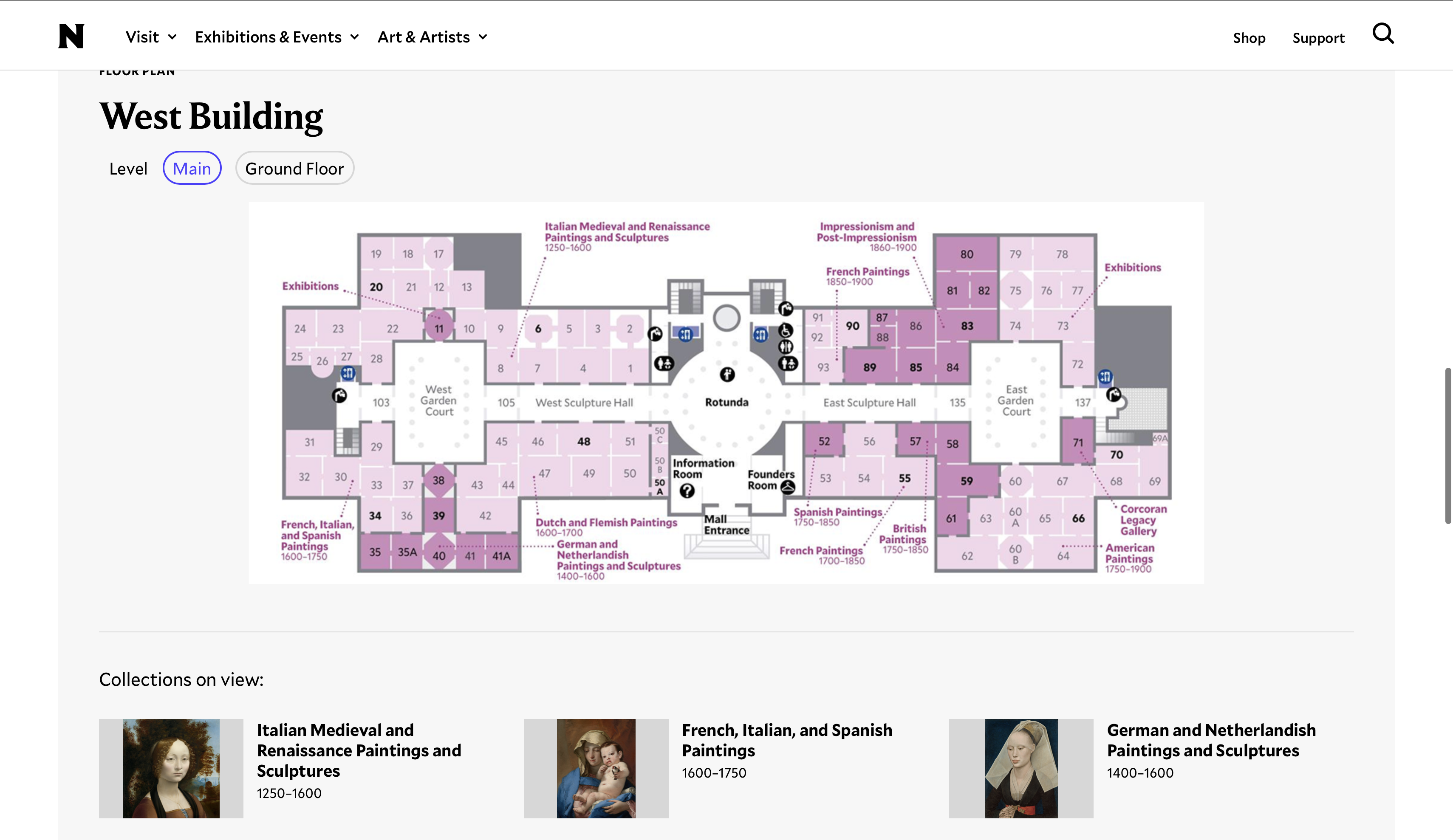
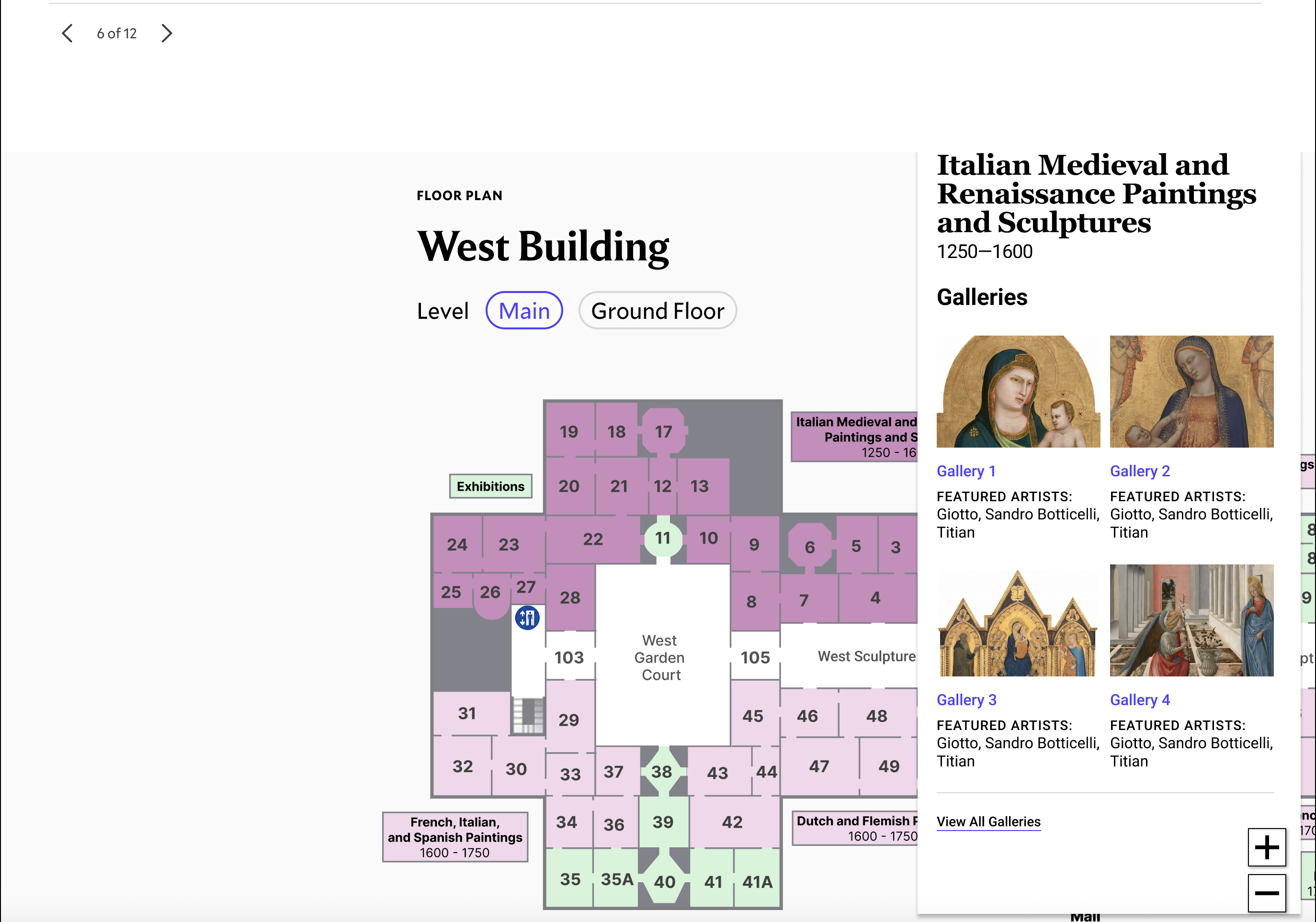
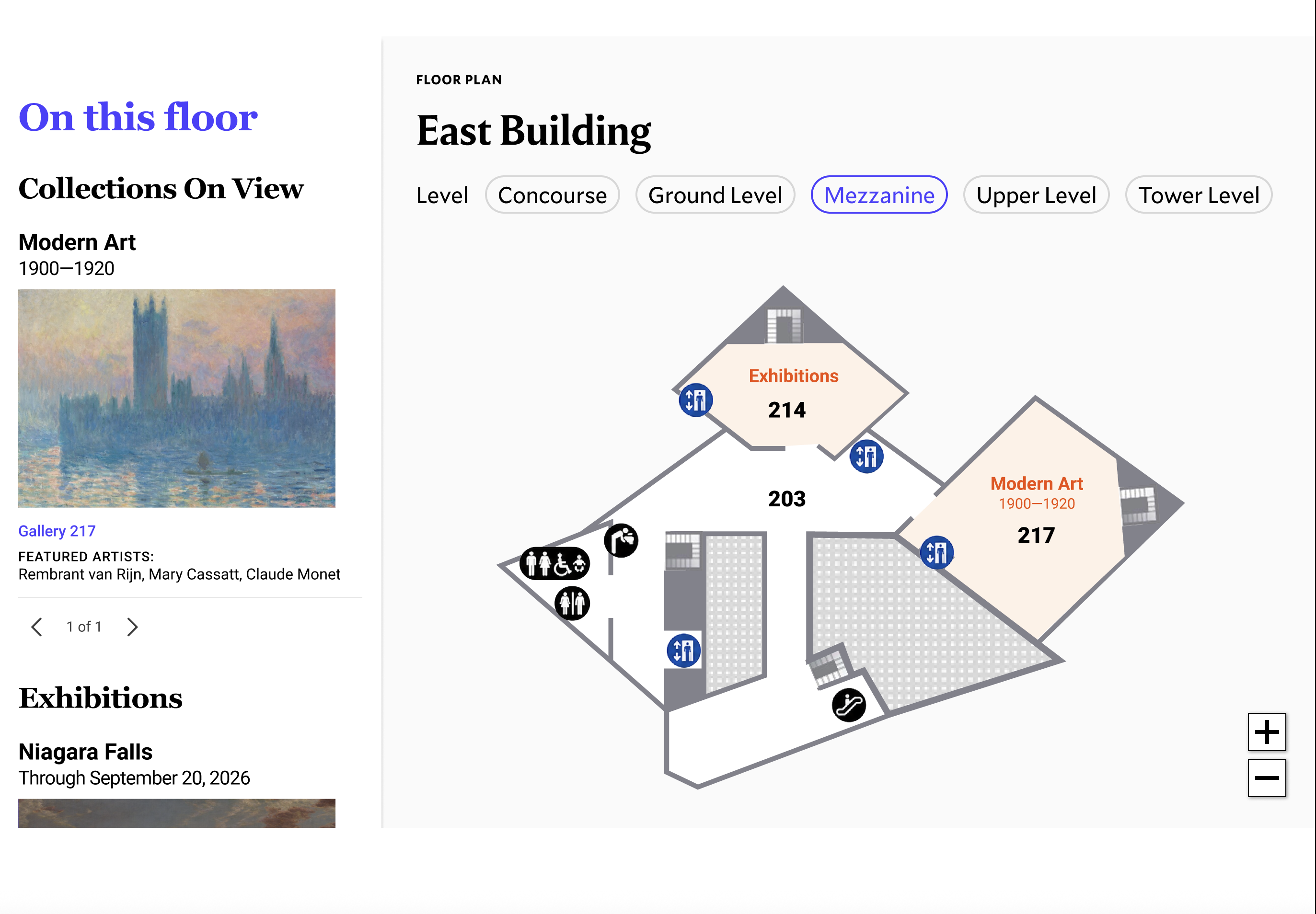
The floor maps show where galleries are. Participants needed to know what was inside them.
Participants used the floor maps to orient themselves spatially, but they couldn't get what they actually wanted: a sense of what was on each floor and whether it was worth visiting. The East Building's 3D map made this harder. And on artwork pages, the On View location field was there but not clickable — which frustrated participants who had found a piece they were interested in and wanted to know exactly where to go.
Create a connected interactive map-and-sidebar experience
The floor map and the collections information below it currently have no connection to each other. A two-way system — where selecting a floor updates the sidebar with what's available there, and selecting an item in the sidebar highlights it on the map — lets users explore from either direction.
Current state
Map and sidebar linked — two-way system
Structure the sidebar as a swim-to-dive experience
The sidebar should start at floor level — showing collections, exhibitions, and food options — and let users drill down to gallery cards with artwork images and artist names, then to individual artwork pages. This mirrors the Skim/Swim/Dive structure of the study and how participants naturally wanted to explore.
Current state
Sidebar from floor overview to gallery-level artwork previews
Standardize to a consistent 2D map style across all buildings
The East Building's 3D map was consistently harder to interpret than the West Building and Sculpture Garden maps. Participants weren't sure if the shapes were walls, stairs, or floors. Matching the 2D style used elsewhere makes the maps easier to compare across buildings.
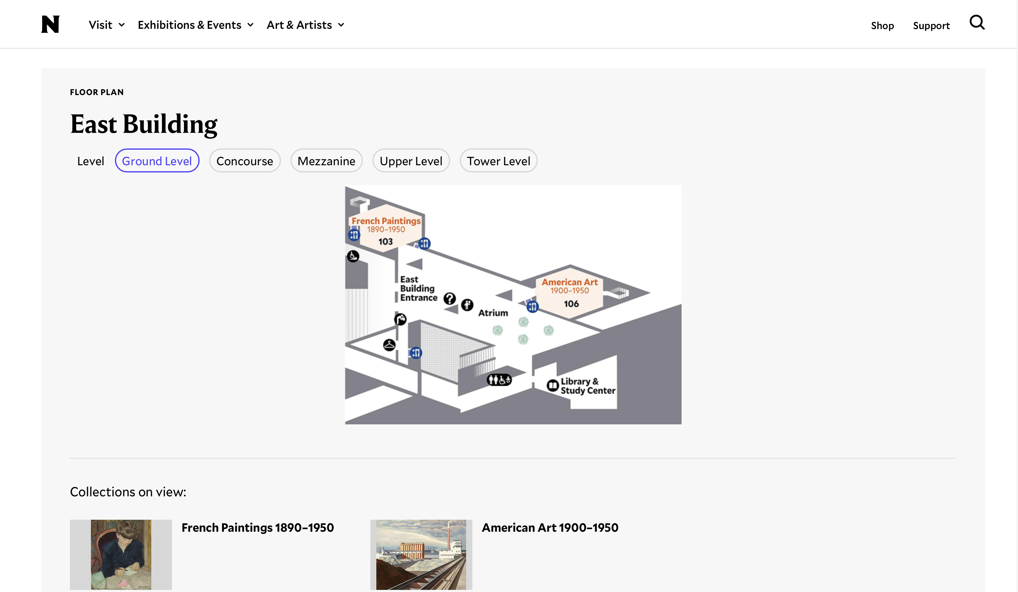
Current state
East Building redesigned in consistent 2D style
Link the On View location on artwork pages to the map
Several participants found an artwork they were interested in and then tried to click the On View location to see exactly where it was. It wasn't a link. Making it one — so it opens the relevant building tab on Explore the Campus and highlights the gallery — closes the loop between artwork discovery and physical navigation.
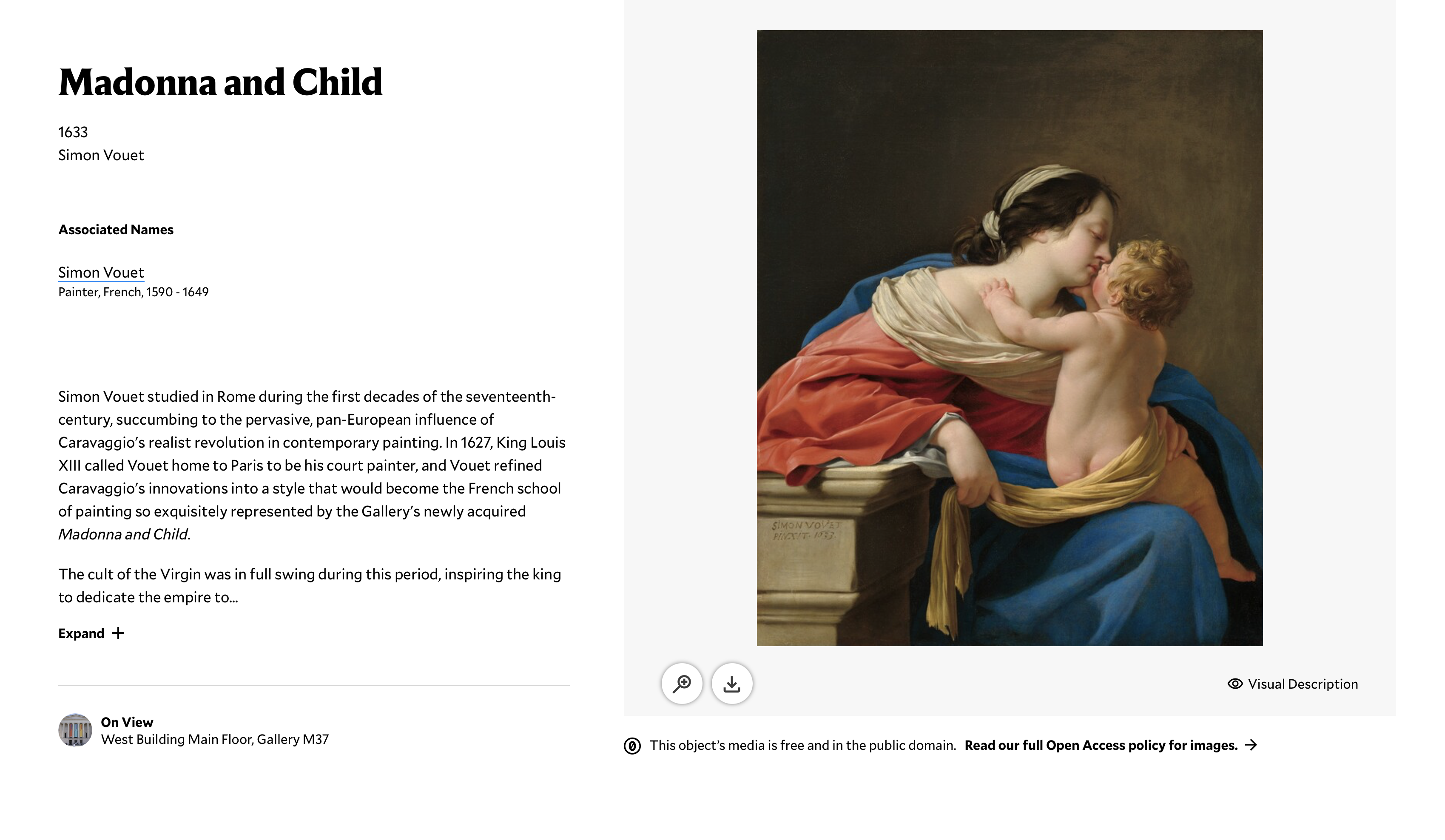
Current state
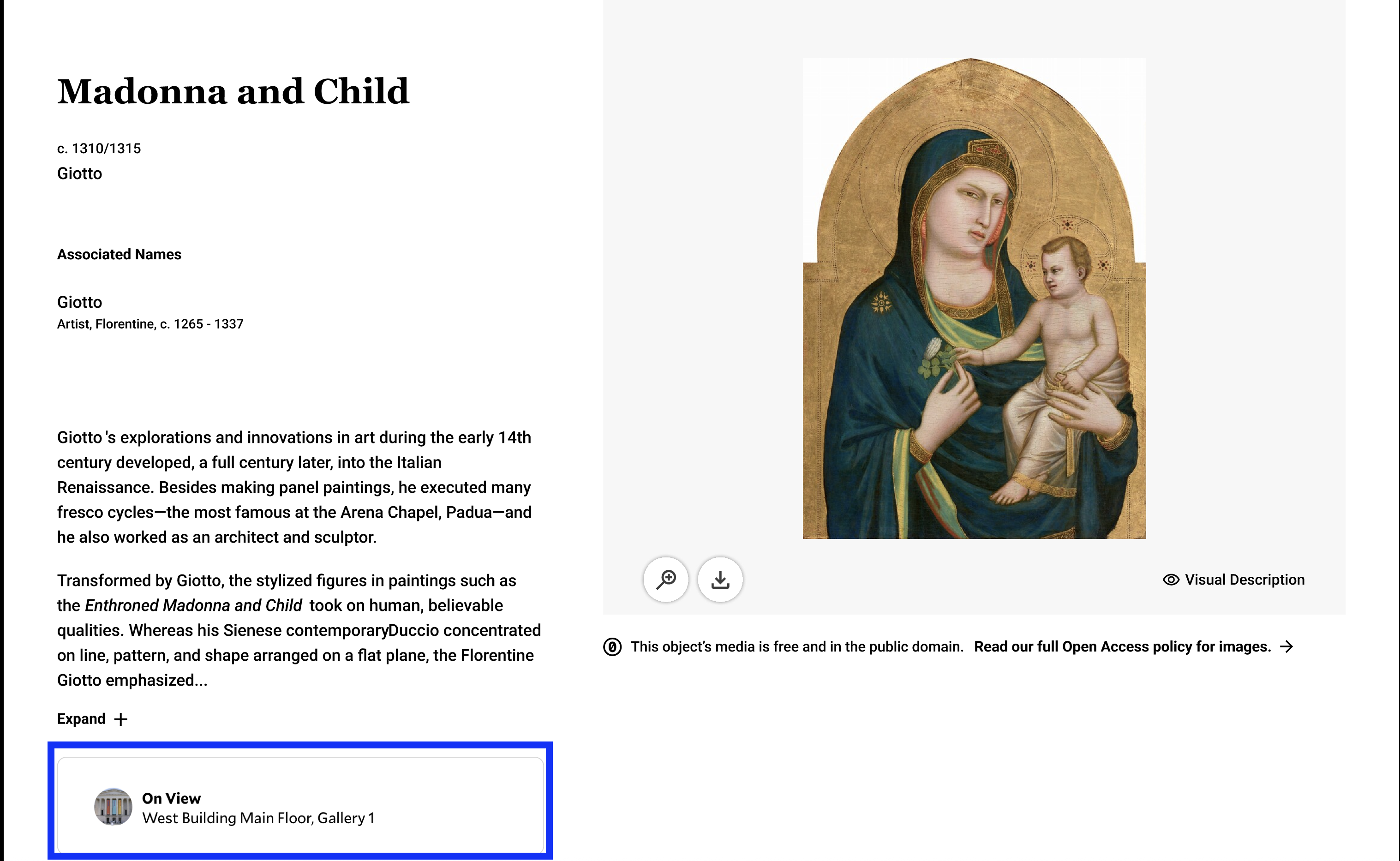
On View links to exact gallery on the floor map
One thing that would be nice would be like some sort of quick subheader. East Building and it gives like a summary. I sort of had to infer by clicking on each page to see what's there.
Participant, Task 3 debriefHow difficult were the tasks?
Five tasks asked participants to rate difficulty on a 1-5 scale after completing them. Two tasks crossed the 3.0 threshold; one stayed under 1.5. The most telling result was Task 4c (find abstract art in the East Building), which averaged 4.12. That wasn't because the site failed to have the information — it was because the page used art historical terminology that most participants had no frame of reference for. Task 5 averaged 1.25 because participants were searching for something they already knew they liked.
| Task | What we asked participants to do | n | Avg. difficulty (/ 5) |
|---|---|---|---|
| 1b | Gauge campus size and time needed for visit | 8 | 2.62 |
| 2c | Determine building size and inter-building walking distance from map | 7 | 3.50 |
| 4a | Find Impressionist works and their exact location | 7 | 2.00 |
| 4c | Locate abstract works in the East Building | 8 | 4.12 |
| 5 | Find artwork tied to participant's stated interests | 6 | 1.25 |
03 · The Process
Why moderated testing, and how we ran it.
We chose moderated usability testing over an unmoderated approach because we weren't just trying to measure whether participants could complete tasks. We wanted to understand why they made the choices they made, and where their mental model of the site broke down. Think-aloud protocol was key for that. The moments that told us the most weren't when participants failed a task. They were when participants talked themselves into the wrong direction and didn't realize it.
We ran eight sessions over Zoom in April and May 2026, each 30-45 minutes long. Every session had one moderator and one note-taker. Participants were recruited through Private Panels, Pratt's participant recruitment platform, and screened to match the Sightseer profile.
How we structured the tasks
We built the task structure around the NGA's Skim/Swim/Dive framework, which meant each task was designed to test a specific level of information need. Skim tasks covered basic logistics. Swim tasks covered building-level comprehension and prioritization. The single Dive task asked participants to find a specific artwork tied to their own stated interests and locate it in the museum. We also tracked discoverability of the Explore the Campus page itself as a crosscutting question across all tasks.
Can a Sightseer get the basics they need to plan a visit without being directed anywhere specific?
Can a Sightseer understand what each building offers well enough to decide where to spend their time?
Can a Sightseer find a specific artwork tied to their own interests and locate it exactly in the museum?
Who we recruited
We recruited eight U.S.-based participants through Private Panels. Four tested on desktop, four on mobile — a deliberate split, given that 61% of the NGA's site visitors are on mobile and we expected the two experiences to tell different stories. All participants were ages 18-65, had visited at least one museum in the past two years, had no professional affiliation with cultural institutions, and were non-D.C. residents (so there was no geographic familiarity with the National Mall to lean on).
Screener: three questions to confirm the Sightseer profile
Museum-going behavior
How many times have you visited an art museum or gallery in the past two years?
Qualifies: 1+ visits
Disqualifies: 0 visits
Industry knowledge
Do you currently work or volunteer at an art museum, gallery, or cultural institution?
Qualifies: No (no insider knowledge)
Disqualifies: Yes
Trip-planning context
When planning a trip to a new city, how likely are you to visit a museum or cultural attraction?
Qualifies: Somewhat or very likely
Disqualifies: Not likely
How we synthesized findings
After all eight sessions, we pulled our notes together and mapped recurring patterns using affinity mapping. We grouped observations by theme across participants, looking for patterns that held across both device types and across the different task levels. Qualitative patterns were then triangulated against the quantitative signals from the task difficulty ratings to help us prioritize which findings to lead with.
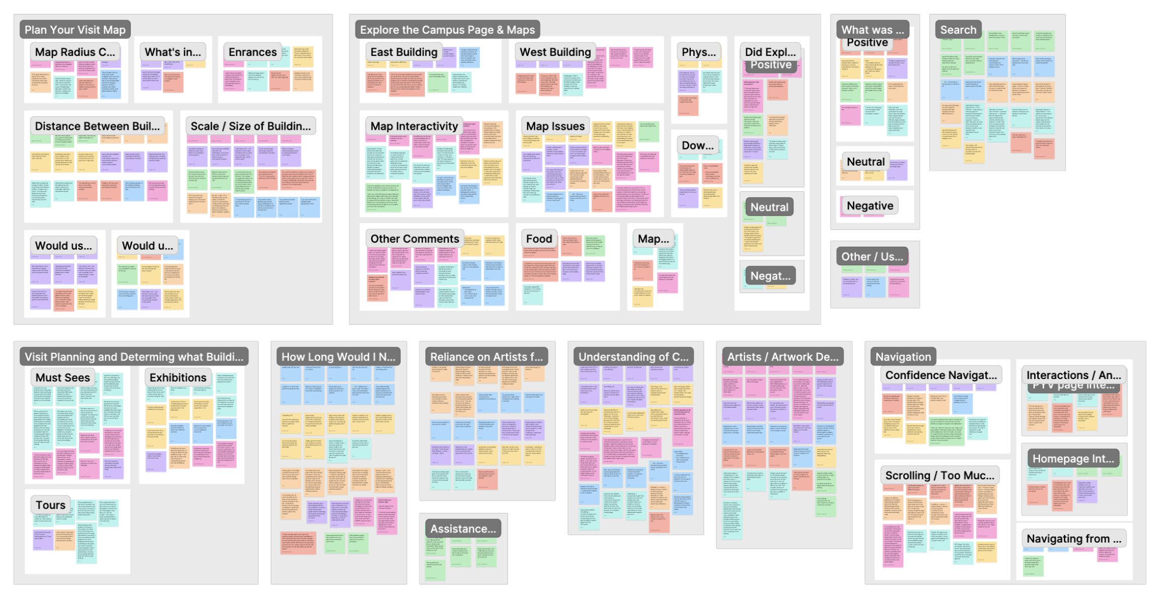
Affinity groups spanning Plan Your Visit, Explore the Campus, visit planning, navigation, and more
04 · Conclusion
And lastly... what did I learn?
We delivered our findings to the NGA team through a live presentation and written report in May 2026. They had commissioned this study specifically to evaluate the newly redesigned pages, so we were giving them concrete evidence at exactly the right moment.
Add a sentence about how the presentation landed. What did the NGA team respond to most?
Our recommendations ranged from quick wins (adding an arrow to a card, adding a sentence under a building name) to more structural redesigns (making the floor maps interactive, connecting them to a sidebar that surfaces what's actually in each area). We prioritized deliberately so the team could start moving on smaller fixes while planning for the bigger ones.
Delivered to the NGA team, May 2026
If I kept going...
The most obvious next step would be a follow-up study testing the recommended changes with the same Sightseer profile, especially on mobile where we saw the biggest failures. I'd also want to recruit some participants who were actively mid-trip and researching on the fly, since the Sightseers we tested were mostly planning from home in advance. That's a different mindset and probably a different set of friction points.
Key Takeaways